TIMELINE
-
4 HOURS


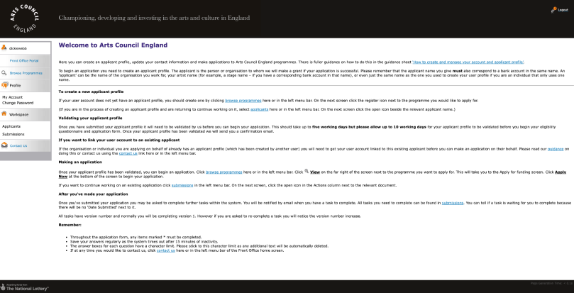
Lots of text explaining what should be a simple process. This is summed up with initial text advising that users read the guidance notes on how to use the portal.
The portal is trying to give everything at once. Instead it would be good if advice is on the screen when a user is moving through the corresponding part of the application. This could then work in tandem and avoid overloading.
The text on the portal page has lots of hyperlinks. This means users are moving away from this page which can be avoided instead by walking users through applications step-by-step and providing information appropriately.
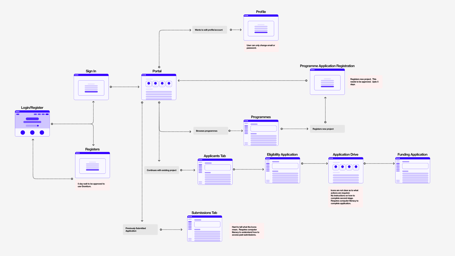
A user is only able to update email and password on their account page. Any other changes they are required to create a new applicant and this takes up to 5 days to be approved.
The wording in the menu could be made less confusing. Using Home or Dashboard instead of Front Office Portal would be better. Clear word choice for Applicants and Submission would be useful so users know where to find what they need.
The current navigation works for those who know where to find the information. However it is not a familiar or intuitive layout.
This is a block description. To edit this description, click on the text and replace it with your own content. Use this space to convert site visitors into customers with a promotion

I STARTED WITH PENCIL AND PAPER JUST MOCKING UP QUICK IDEAS REGARDING LAYOUT AND HOW INFORMATION COULD BE LAID OUT. THIS ALLOWED ME TO WORK FAST WITHOUT HAVING TO BE TOO PRECIOUS.
THESE ROUGH PAPER LAYOUTS WERE ALLOWED ME TO CREATE SOME SIMPLE LOFI DIGITAL WIREFRAMES IN FIGMA.
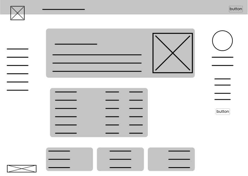
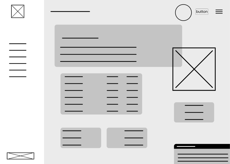
With a dashboard there is opportunity to create a personalised feel to the portal. Adding applicants name to the salutation and letting them know they have an application still to complete.
CTAs are front and centre in the dashboard especially for the two main processes, New and completing Existing applications.
Funding programmes displayed in the centre of the dashboard breaks up the CTAs with information that can prompt an action. Instead of hiding these details.
I have chosen to remove the majority of the text that currently exists on the Front Office Portal. On the new dashboard I have simplfied the navigation and allowed those that are computer literate and anyone who has used similar account pages to navigate without need to read additional guidance notes.
Guidance is still available through the Help and Contact menu pages. I believe by making the portal intuitive I can reduce unnecessary issues being raised with the help desk. This will allow better communication with those users who still require additional help due to less call volume.
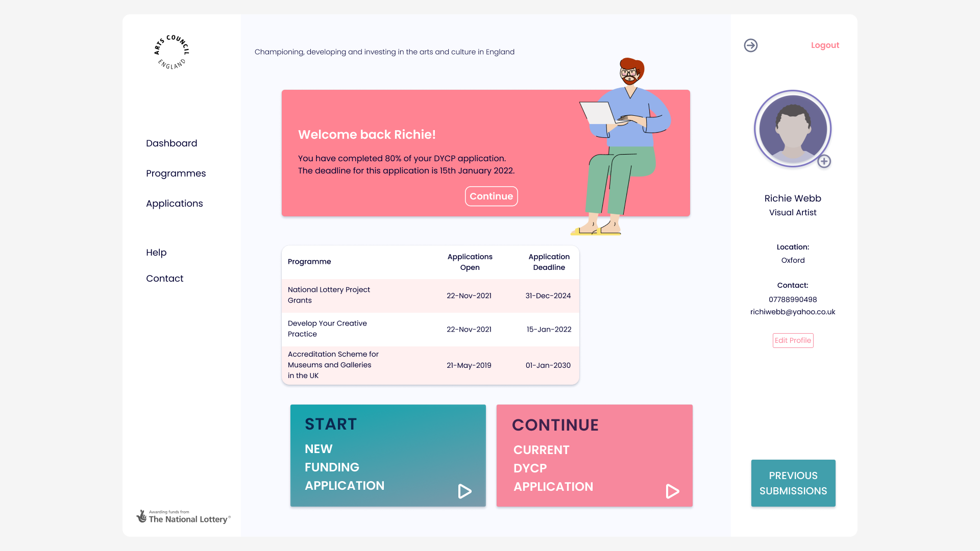
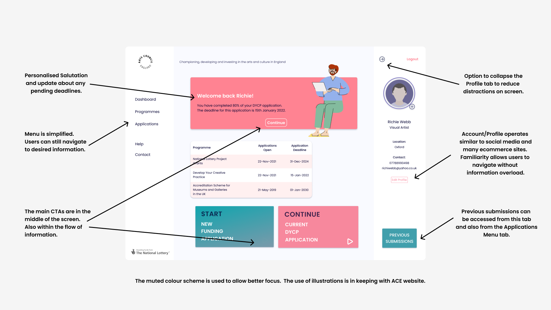
Creating a dashboard made me consider how much a user needs to still complete tasks. Yes making it clean and clear however reminding myself that a user is here to complete certain actions.
I believe testing would highlight areas that require better understanding of how a user navigates a simplified dashboard.
With this challenge I used simple rules from Atlassian design system to guide me. It made me realise how important a system can be to aid the structure and consistency of a design.
This dashboard is really a portal in the sense it will lead to other pages so having a DS will really help a user move through any process if this system is applied throughout.
This design was critiqued and like with any UX review there were positives and negatives. The main two areas to address were edit functionality, whilst this looks tidy it might require better sign posting for all users.
Words used for submissions and applications could be confusing so testing this to see what works best would be essential.