RECRUITMENT PLATFORM ONBOARDING REDESIGN.

Tempo is an UK based all-in-one recruitment website.
It promises to expedite the recruitment process for both job seekers (B2C) and recruiters (B2B) by utilising video and machine learning, reducing hiring time frames to days rather than weeks, whilst saving recruiters up to 65% in costs.
Tempo seeks to deliver a different recruitment experience for both applicants and employers. They want to shake things up and make the process more user friendly.

OVERVIEW

TIMELINE

7 WEEKS

SELF DIRECTED PROJECT

CASE STUDY DEVELOPED WHILST ON THE CODERS GUILD UX BOOTCAMP

SOLE DESIGNER

PRODUCT, UX, UI and Strategy

Applicant strategy onboarding. Decisions backed by user research. Information architecture based on users needs and wants.

DELIVERABLES

USER SURVEYS, COMPETITOR ANALYSIS, WEBSITE AUDITS, PERSONAS, EMPATHY MAPS, USER JOURNEYS, WIREFRAMES, PROTOTYPES.

THE CHALLENGE

This project focuses on the user experience of job seekers visiting the site for the first time and how we can increase onboarding of new applicants to the Tempo platform.
It seeks to find innovative ways that Tempo can stand out from its competition and aid those looking to find their next job role. As this is a self directed project there are some assumptions regarding the business. I have personally used the service in 2019 with no success and wanted to revisit this platform to see how it could be improved for future users.

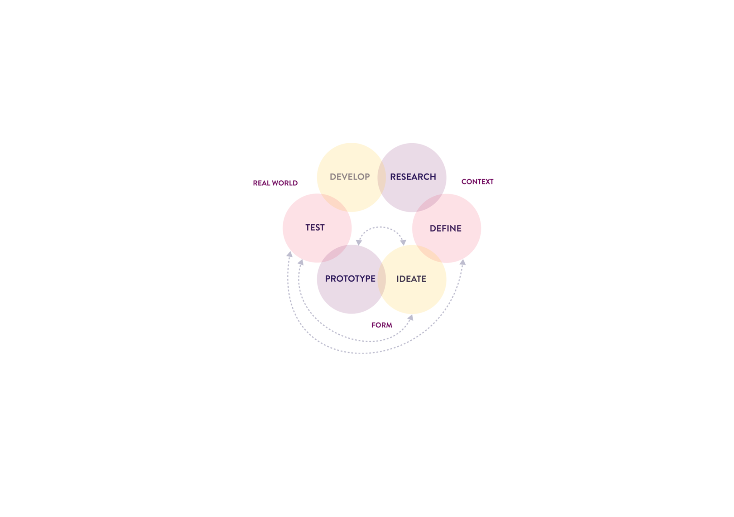
DESIGN PROCESS

RESEARCH - Discovery and Analysis

Website Audit--User Surveys--Competitor Analysis

DEFINE - Empathise and Definition

Personas--Empathy Maps--User Journeys

IDEATE - Design and Ideation

User Flows--Wireframes--Service Blueprint

PROTOTYPE - Create and Test

EXECUTIVE STATEMENT

We want our recruitment platform to onboard candidates in an effortless manner, maximising the benefits of machine learning and personalised profiles to allow individuals to be matched or find the best roles available.
Currently we do not allow new candidates to browse current job vacancies without completing a comprehensive personal profile. Our analytics show a high bounce rate from our ‘Hire Me’ page and many inactive accounts from those candidates not supported by our current locations or employment sectors.
Operating with some transparency would allow job seekers to search job listings whilst building their profile in tandem. Active communication regarding what, why and how Tempo is using their profile information would help alleviate known frustrations and motivate consistent engagement with the platform.
We will be able to measure the success by comparing analytics, active versus inactive accounts and also how many new candidates complete our onboarding process. Recruitment rates should then naturally increase and would be assisted in understanding areas where we could also expand to fill a waiting need.

    Solution

    Job Search Front and Centre

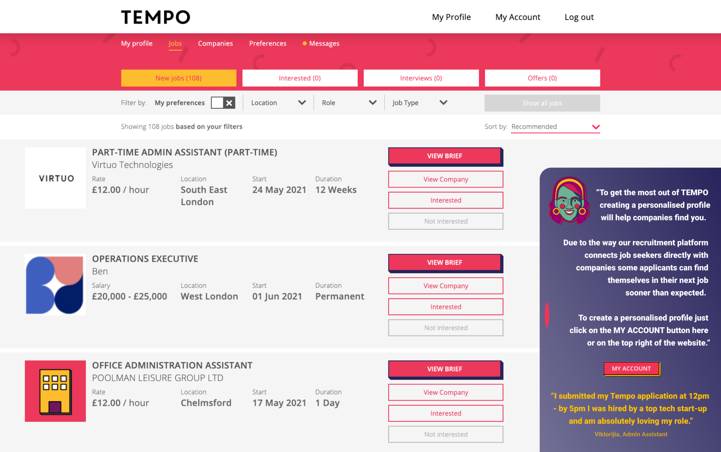
    Allowing the user to search job listings without having to create a personalised profile page. Bringing this front and centre allows applicants to decided initially if the recruitment platform offers roles of interest to them.

    Creating a Candidate Assistant to Aid Registration and Profile Completion

    The creation of an assistant panel that prompts users how to get the most out of the recruitment platform. Suggesting resources or best means to expedite their job search. Directing them to next steps so they can complete applications for desired roles.
    TEMPO CASE STUDY

    PROCESS

    Discovery & Analysis

    Website Audit

    I started with a website audit to examine all elements of the onboarding process. Learning how various users might navigate the current website.
    I carried out the audit from a job seeker perspective.
    Pros
    • The site is welcoming and friendly. Less sterile than other online platforms.

    • It makes it clear that it engages with both applicant and recruiters.

    • The honest nature of the content, stating that finding a new job is not easy.

    Cons
    • Lack of detailed information. It does not explain machine learning and how this is different or better.

    • Advertises nationally however in reality the jobs are primarily in London or remote. Only odd jobs advertised in other cities.

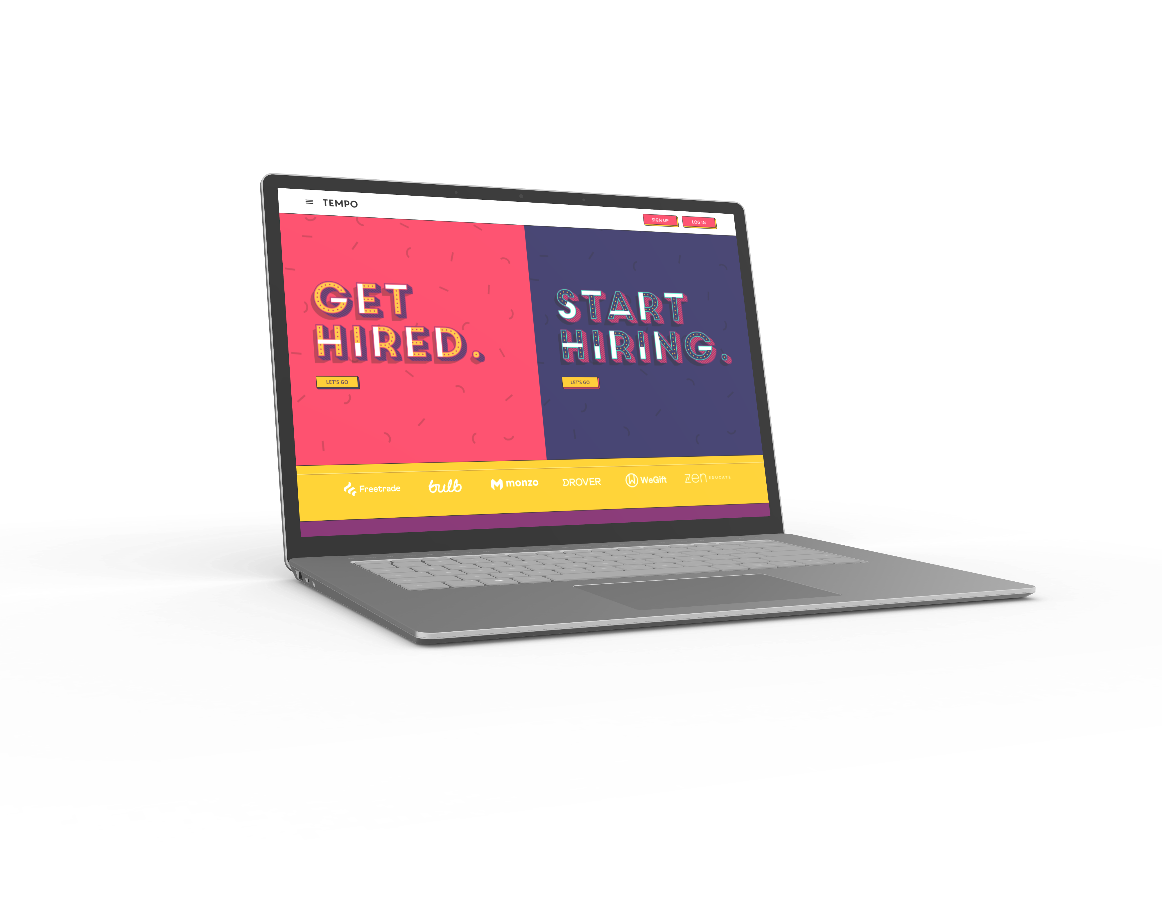
    • The tone of the site is aimed at a young demographic, "Finding a job sucks." This is great to catch peoples attention however Tempo is quite vague on how it does anything new or different.


    WEBSITE PAIN POINTS

    JOB LISTINGS HIDDEN

    Unlike other online recruitment platforms you are not able to browse available jobs. Recruitment websites normally have these on their landing page. Even high street recruitment agencies have their jobs in the window/newspaper.

    DEAD ENDS

    On the second page there are some prescribed job search questions. Once you have answered these you are prompted with an account registration CTA. The questions do not provide the user with any information.

    REPETITIVE TASKS

    The questions asked on page 2 regarding your employment search criteria are then repeated when creating your personal profile. The information is not carried over so it feels like you are being asked the same questions multiple times.

    MANDATORY PROFILE

    Even though a personal profile is sometimes required to apply on other websites here it is mandatory to view the listings. To create a profile consists of 31 tasks some of which are arduous and all in all takes time.

    NEXT STEPS

    From carrying out this audit I felt it was necessary to get the input from users to see what they preferred and expected from a website. This would allow us to see whether the pain points were worth developing solutions for.
    DISCOVERY & ANALYSIS

    USER SURVEYS

    I used an online survey platform called SmartSurvey to create a simple form that would allow me to collect information from a wide audience of users.

    30 PARTICIPANTS

    This group of users had an age range from 21 - 50.

    Only 2 participants had not used an online recruitment platform before.

    11 QUESTIONS

    The survey was structured to validate certain questions. Some questions were designed to collect information to help understand users wants and needs.

    TYPE OF DATA

    This survey allowed me to collect both quantitive and qualitative data types.

    SURVEY RESULTS

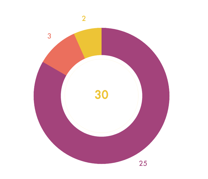
    Participants were asked in which order they prefer to see job listings before or prior to creating an account and profile. The options for answering this question were randomised.
    25

    Prefer reviewing job listings first.

    3

    Preferred creating a profile first prior to seeing available job listings.

    2

    Had no preference in what order they viewed job listings and created a profile.

    PROFILE CREATION

    I asked participants whether they had a preference to creating a profile before or after searching job listings.
    • 25 Stated that they prefer to search job listings first.
    • 3 Said they prefer to create a profile first so that they can instantly apply for a job role.
    • 2 Participants said they had no preference.

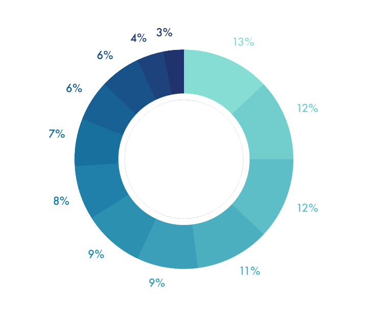
    INFORMATION HIERARCHY

    Seeing currently available job listings - 13%
    Searching for job titles or keywords - 12%
    Clear job descriptions - 12%
    Searching by location - 11%
    Filtering jobs by industry - 9%
    Filtering by desired salary or wage - 9%
    Uploading your own CV/Resume - 8%
    Instructions on how to apply for jobs - 7%
    Upload work history so website can create CV - 6%
    Creating a personalised profile - 6%
    Ability to add references to your profile - 4%
    Adding a photo or video to your profile - 3%

    QUALITATIVE DATA

    Tempo states that recruitment sucks so I thought it would be best to find out what participants believe would make the whole process that bit easier. Here are some of the requests of how recruitment platforms could make it better.

    "Relevant roles to match CV or work experience."


    "Simple to navigate"

    "Easy to upload cv, not needing to retype into boxes on their website."


    "Ability to show a more casual interest in a job."

    "Real-time information on what the site is doing for you."


    "Reveal details of the job sooner in the process. Recruiters often conceal info like salary."

    "Personalised support with 'caseworkers'."


    "Feedback or suggestions from previous interviewees."

    DISCOVERY & ANALYSIS

    COMPETITOR ANALYSIS

    There are no shortage of options for job seekers when looking for their next role. For this case study I looked at 10 current offerings.

    POINTS OF PARITY

    All the job listings on these sites contain similar information. There is little difference between content however it is hard to tell how current or active some listings are.

    Some sites are dealing with 100's of listings whilst others are dealing with 1000's. However this is also reflected in the size of the companies.

    TYPE OF PLATFORM

    There are three types of platforms currently being offered, Agency, Job Board and Social Media.

    The agencies similar to Tempo have a closer relationship with both employers and job seekers. Job boards and social media sites advertise current jobs but it is less clear how involved on a personal level.


    POINTS OF DIFFERENCE

    Apart from Glassdoor all the above competitors have their current job listings on their homepage. Glassdoor requires creating an account but no need to create a profile.

    DEFINE & EMPATHISE

    PERSONAS

    I developed 4 personas to reflect those groups of job seekers. These personas allowed me to think outside of my own perspective, thinking about how other applicants would find the process of job hunting.
    These four personas were active candidates and I did not create personas for those who are not actively searching a new role. Or for those promoted or referred to a new position and do not go through the process of searching for their next role. This does not mean that in future job changes they would not then fit within one of these four personas.

    TERESSA, 27

    Career Progression

    "When I was younger I was always did well in my studies and as I have progressed to full time work I feel at times I am not always reaching my peak. I am looking for a role that will stretch me and help me develop and progress in future years. I don't want to be held back in what I can achieve."

    SETH, 19

    Pre-career

    "I'm not looking to settle into a career just yet as I really have my eyes set on living life whilst I am still young. Having said that I would be keen to work in a company where I can learn skills that will see me onto my next adventure or job."

    CAITLIN, 33

    Return To Work

    "I am trying to find that job that fits around my current family life. My children are at an age where I can start to regain some of my own life and learn some new skills. Being a mother has given me renewed confidence in what I am capable of and I am looking to find a business where I can be a valued staff member"

    JEREMY, 39

    Career Changer

    "I feel that I need to revisit what work is for me. I no longer want a job that is to pay for the things I need rather now at my age I am looking for a job that is something that I enjoy. If I can have some support in finding the right position I believe I will be set up for years to come."
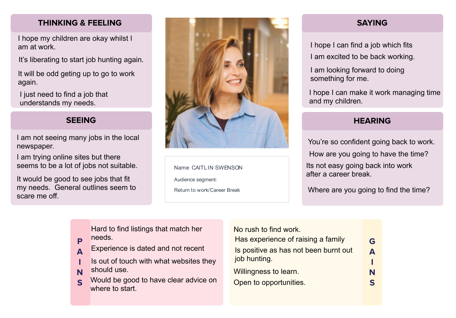
    To See Full Persona Breakdowns

    Click Here
    DEFINE & EMPATHISE

    EMPATHY MAPPING

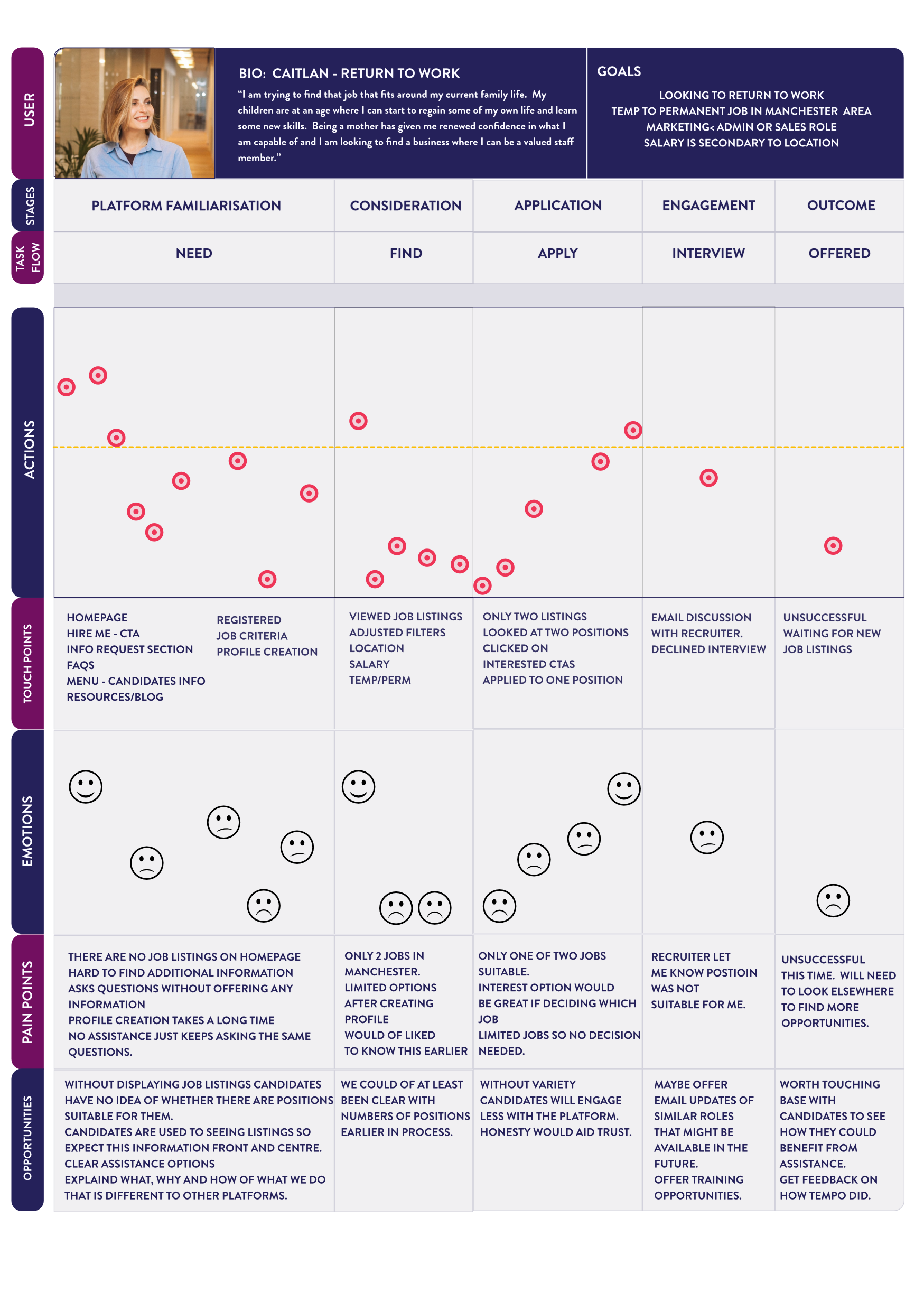
    After creating the personas I developed empathy maps for each one. This added a voice to each persona allowing to highlight what was important.

    To See Full Empathy Maps

    Click Here

    UNDERSTANDING MINDSET

    THROUGH THE PERSONA GENERATION AND EMPATHY MAPPING I REALISED THAT EACH APPLICANT WILL ALSO BE AFFECTED BY APPLICATION FATIGUE.

    WHEN JOB HUNTING YOU WILL HAVE DIFFERENT MOTIVATIONS DEPENDENT ON HOW LONG IT TAKES YOU TO FIND, APPLY, INTERVIEW AND BE OFFERED A ROLE.

    I ADDED THESE FOUR EMOTIONS AS I FEEL THIS WOULD BE IMPORTANT TO ADDRESS ESPECIALLY IF TESTING AND RESEARCH WAS TO BE DONE WITH REAL LIFE TEMPO USERS.
    POSITIVE

    In the early part of looking for work individuals are more likely to be enthusiastic and motivated. The energy and belief is still there.

    JADED

    Whilst a few weeks or a month into seeking employment. Depending on how applications are going questions and doubts can start to affect the psyche.

    FRUSTRATED

    The further an applicant spends doing a task without success will lead to frustration creeping into the mix. This might be only a few weeks up to a few months depending on the person.

    DESPERATE

    At this point months into the job search the individual might actually be open to trying anything even more than in the second two stages. What have they got to lose?

    DEFINE & EMPATHISE

    USER EXPERIENCE JOURNEYS

    From creating Personas and Empathy Maps I created User Journeys for each one. Investigating where their pain points specifically with Tempo and their recruitment platform As Is.

    USER JOURNEY EXPLANATION

    USER

    Outline of which persona this is relating too.

    STAGES

    These are outlines of what part of the process the user is currently experiencing.  

    TASK FLOW

    The steps are the ideal/simplistic process a job applicant goes through to gain employment.

    ACTIONS

    Each action/touch point is recorded on this chart to show how enjoyable they were.

    TOUCHPOINTS

    These are all the interactions this user had whilst using the Tempo recruitment platform.
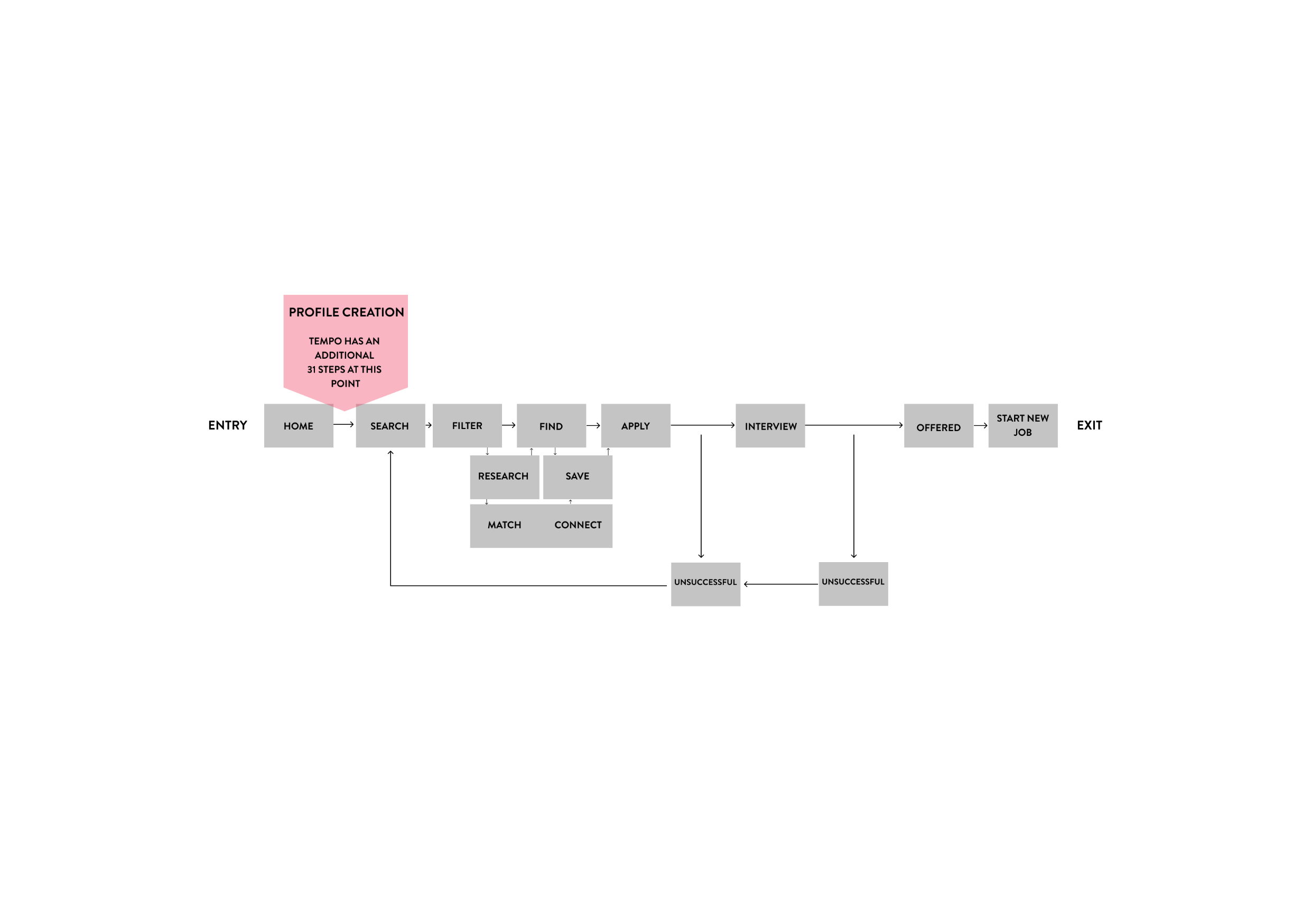
    EMOTIONS

    This faces are to indicate the emotional wellbeing of the user whilst engaging with the Tempo platform.

    PAIN POINTS

    This section highlights the various frustrations this user has experienced using the Tempo platform. Some will be specific to the user and their work experience however others are pain points with the platform itself.

    OPPORTUNITIES

    Drawing out where Tempo can do better. What could be addressed to help users in their search for a new job.

    IDEATE & DESIGN

    USER FLOWS

    I thought by highlighting the User Flow in isolation would be a good visual aid. The potential block or process of creating a profile early on can lead to then decreased motivation or engagement depending on whether the website provided job roles that were appropriate.

    AS IS - CURRENT USER FLOW

    CURRENTLY 31 TASKS

    BETWEEN THE USER AND

    VIEWING JOB LISTINGS

    DEADEND

    From the homepage and through page 2 there are 8 steps but they only lead to a CTA to create an account.

    JOB SERACH CRITERIA

    There are 15 tasks in this section. Many were already asked on page 2.

    EXPERIENCE

    This part has 8 steps and are all important tasks to create a personalised profile.
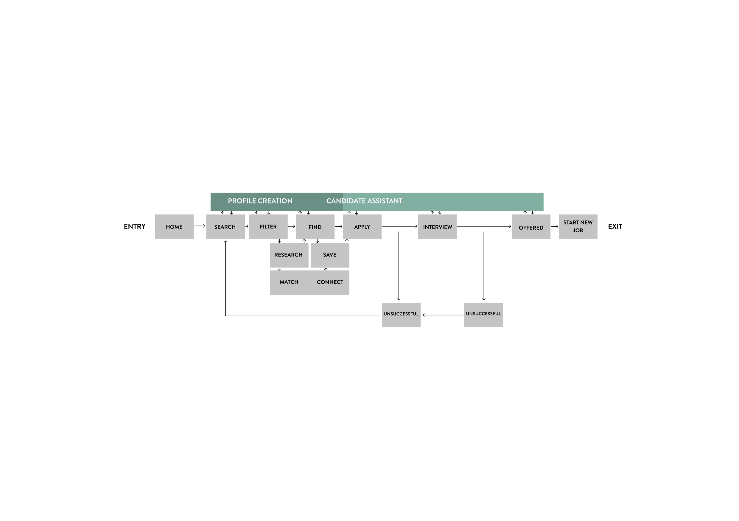
    TO BE - NEW USER FLOW

    IDEATE & DESIGN

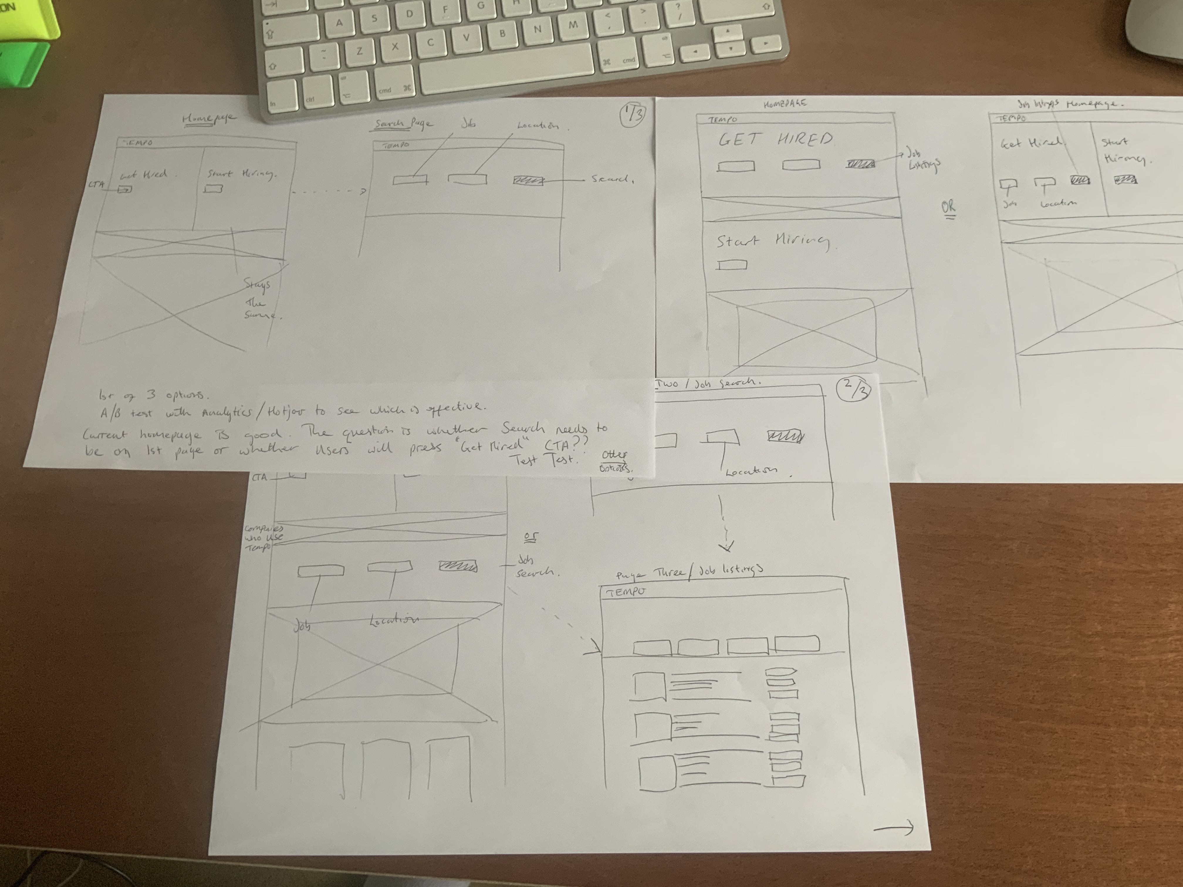
    SKETCHES

    The current website has a distinctive style. I did not wish to go with a full redesign as it is clear this is Tempo's identity. So instead I thought it would be could to integrate the job search either on the landing page or on the second page. I sketched out various versions to get an idea of what was going to work better.
    IDEATE & DESIGN

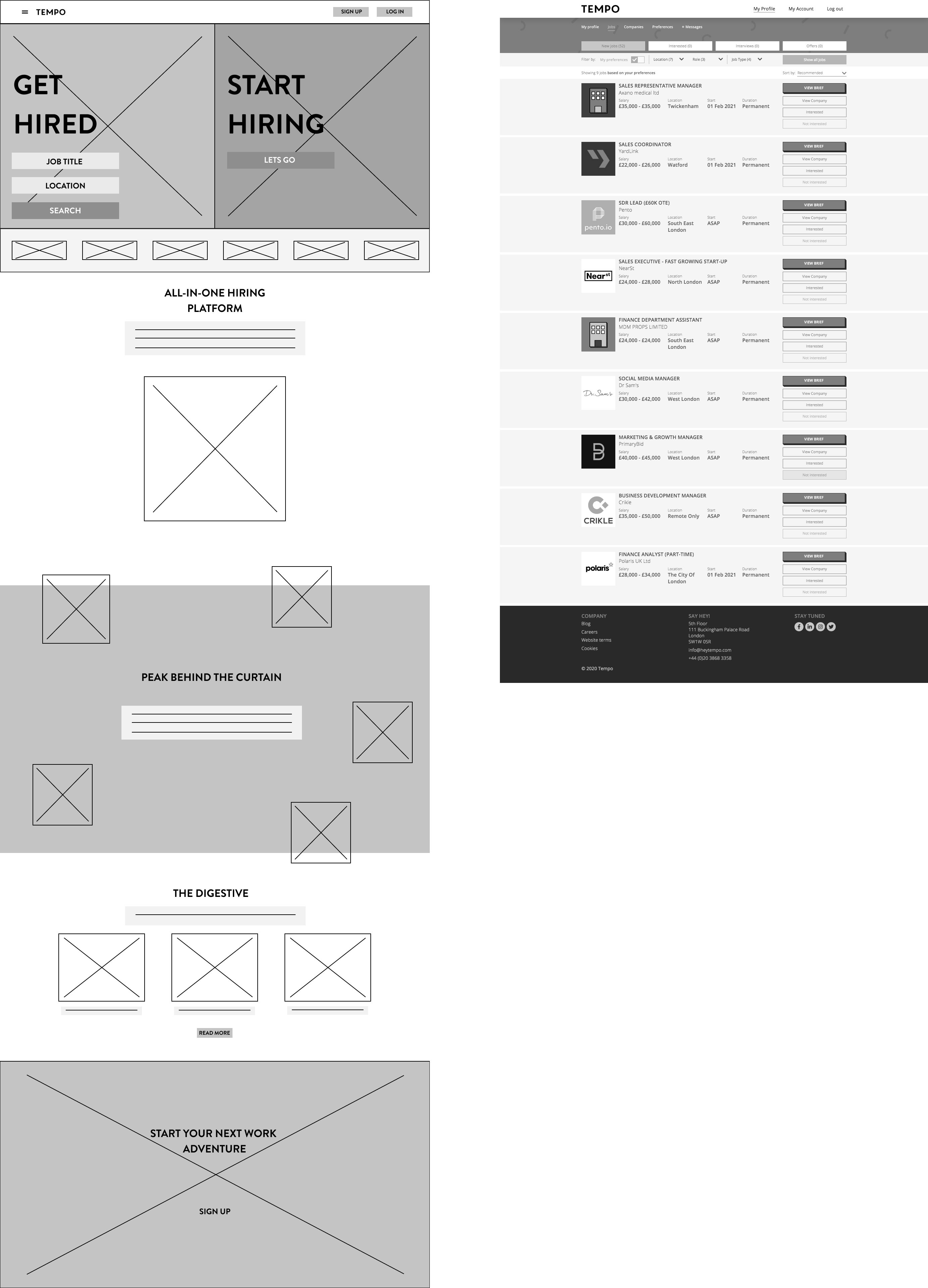
    WIREFRAMING

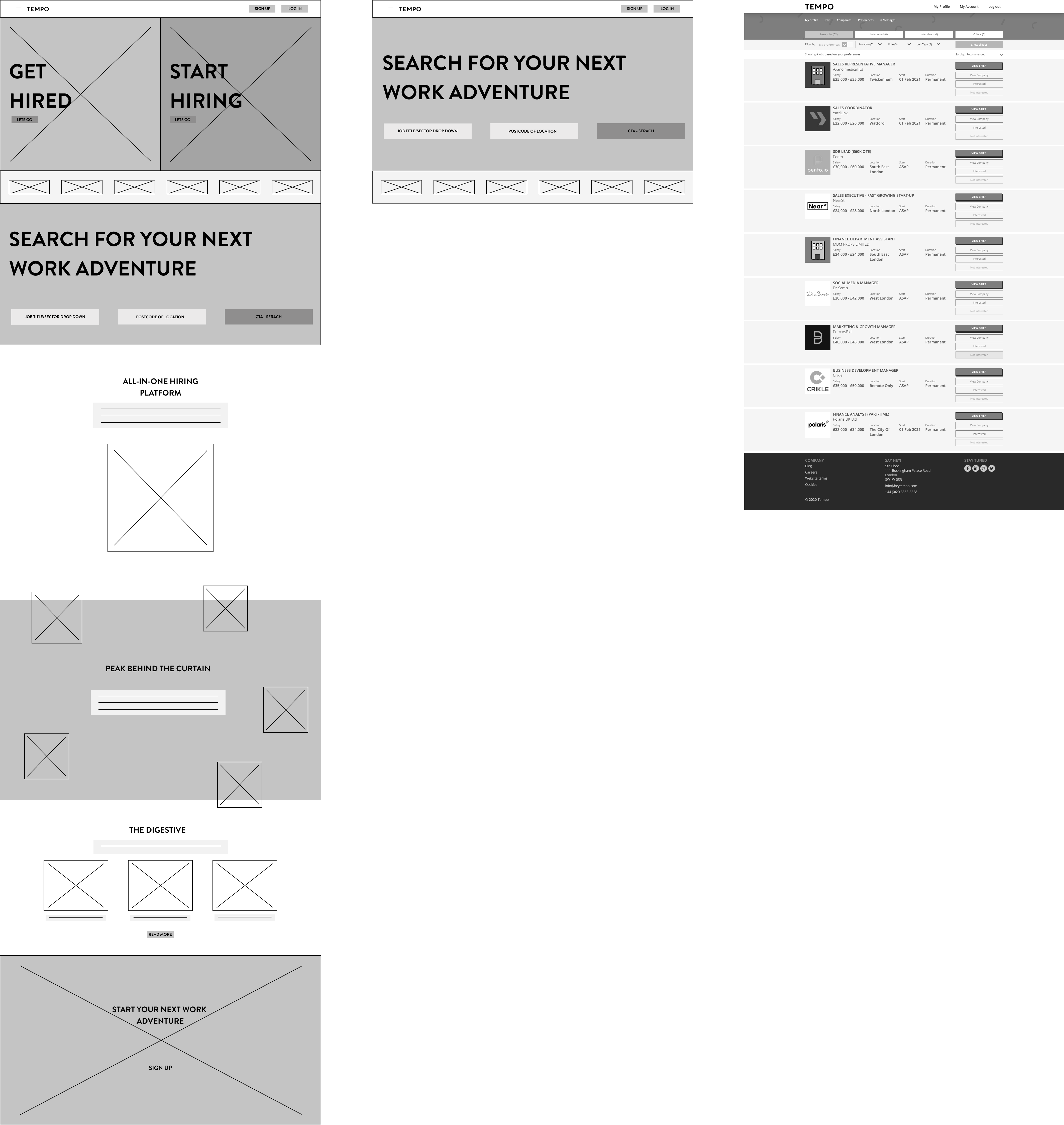
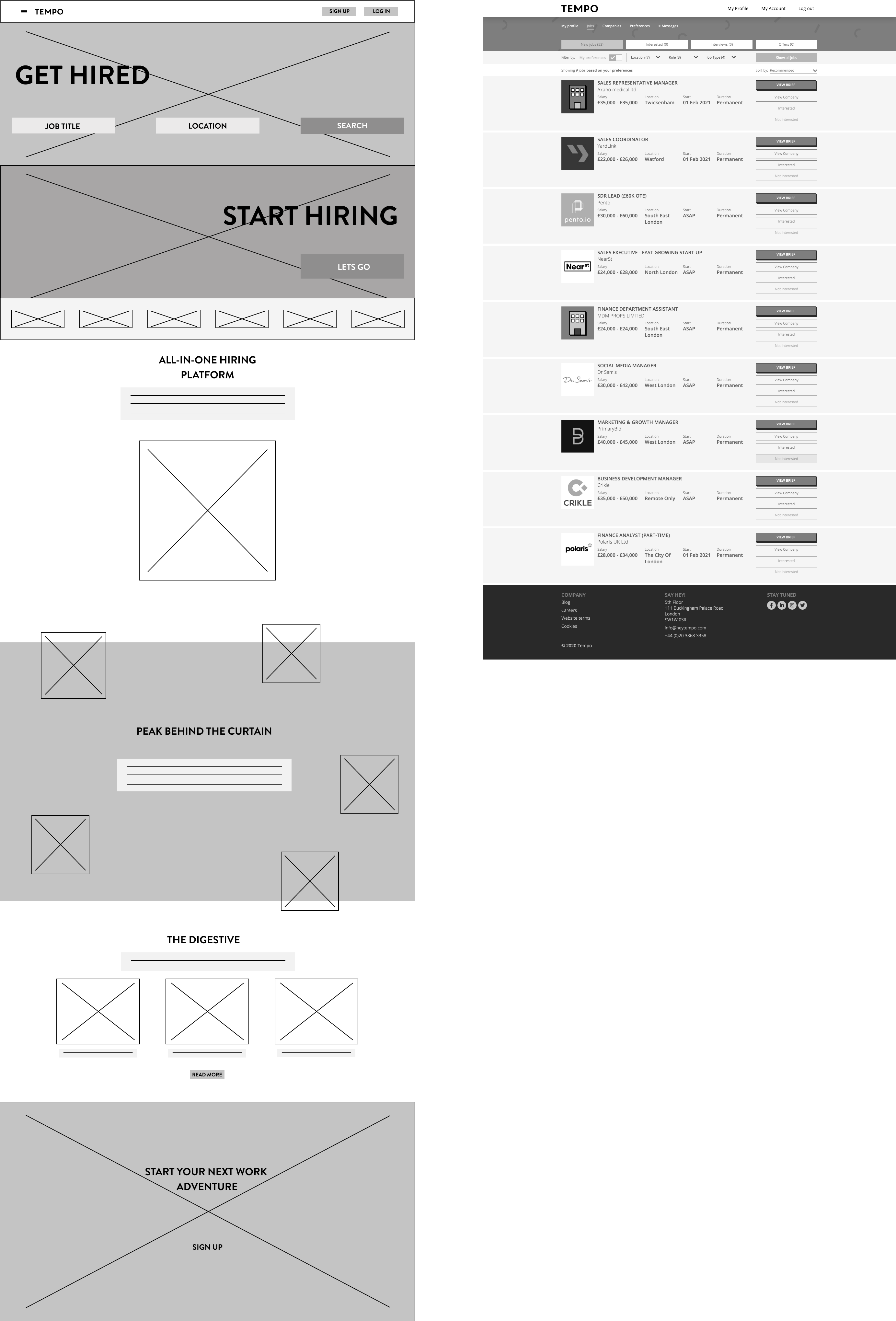
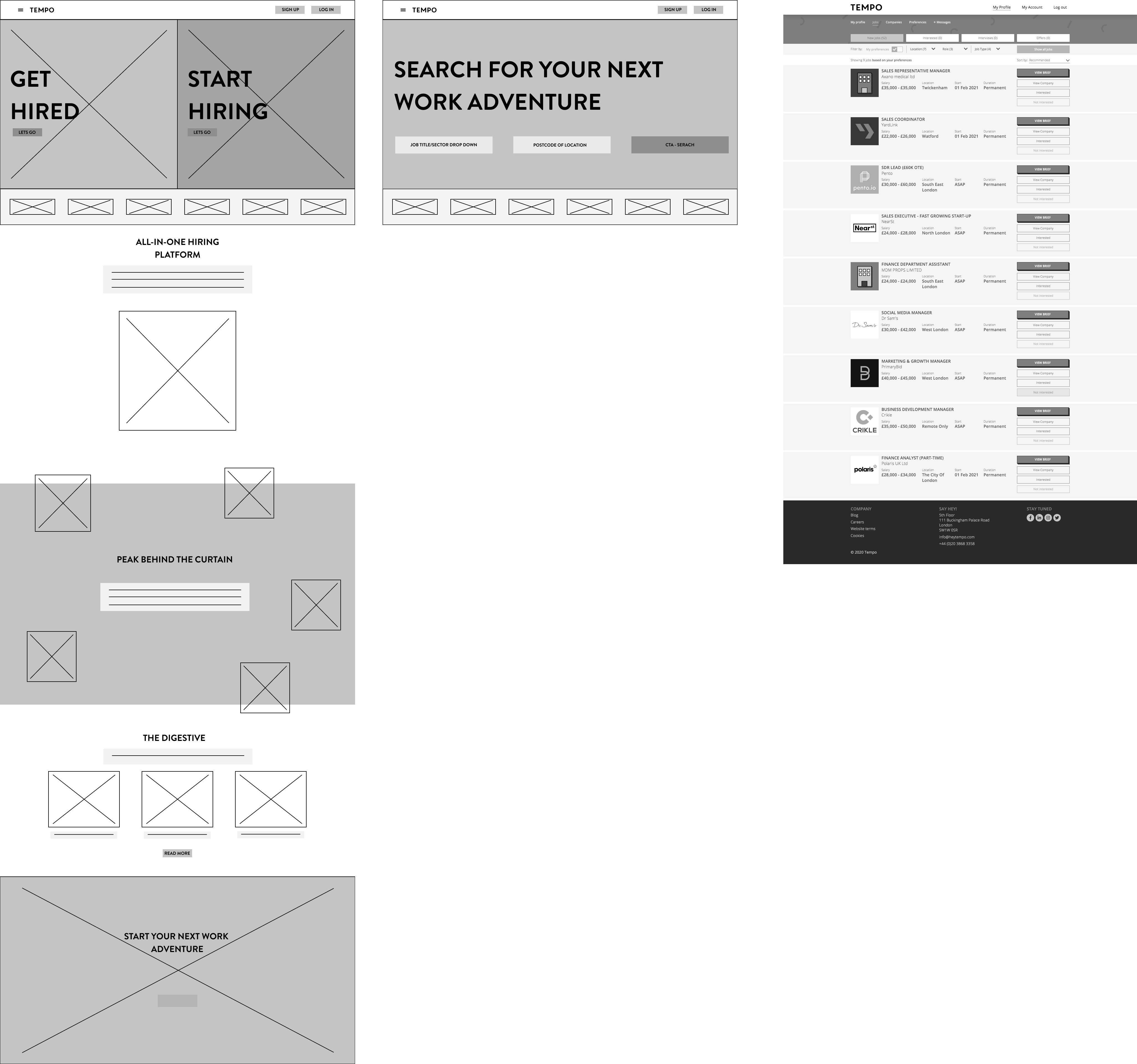
    I took some of the sketches and created working wireframes to see how there would look. Here are some of the various options.

    Job Search Added Below Get Hired On Landing Page.

    Full Search Panel Added On Landing Page.

    Landing Page Changed To Allow Job Search At Top Of Page.

    These initial wireframes still seemed messy and like I was trying to force the Job Search into a layout that was already doing its job. To keep it clean this final wireframe situates the job search on page 2.
    CREATE & TEST

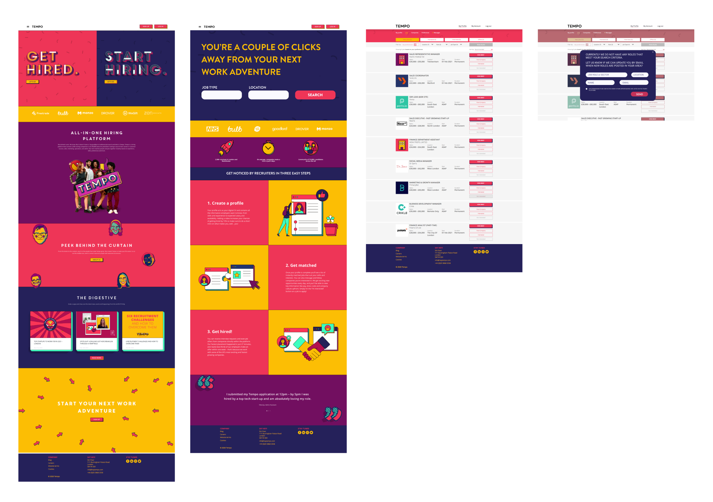
    INITIAL JOB LISTING PROTOTYPE

    I developed the wireframe into a prototype of how the pages will flow. The 31 steps now have been reduced to 4 small steps.
    If anyone inputs information for a non-supported job type or location then it would be ideal to capture this information. This is not done at present but would aid future expansion into other areas of the UK or other employment sectors.

    JOB LISTINGS

    FRONT AND CENTRE

    MEASURABLE UPDATE

    This update will make it possible to measure the engagement due to minimal change to the landing page. A/B testing could be used to test location of job search in this and future updates.

    JOB SERACH CRITERIA

    Simplified initial job search. This allows users to access the job listings without delay. Once on listing page their selection can be narrowed using additional criteria.

    EXPERIENCE

    To access full functionality of the website would only come as users update necessary elements of their profile. A trade off, for engagement with the platform.
    NOW WHAT?

    WHILST THIS SOLVES AN INITIAL PAIN POINT, WHAT SETS US UP DIFFERENT TO OUR COMPETITORS?
    HOW DO TEMPO DO SOMETHING DIFFERENT TO AVOID CREATING THE SAME PAIN POINTS USERS HIGHLIGHTED WITH OTHER ONLINE RECRUITMENT PLATFORMS?


    IDEATE & DESIGN

    USERS WANT TO BE SUPPORTED

    Looking at the Qualitative data gathered from the User Surveys. It is clear that applicants would like to see a supportive online recruitment platform.

    "Real-time information on what the site is doing for you."

    "Feedback or suggestions from previous interviewees."

    "Personalised support with 'caseworkers'."

    IDEATE & DESIGN

    CANDIDATE ASSISTANT

    How to support applicants?

    • USER GOALS

      • Users would like to be supported through application process. Possibly with caseworker or help on hand.

      • Updates on how their applications are progressing.

      • Advice on how to submit successful applications.

    • BUSINESS GOAL

      • Tempo would like users to create complete profiles to allow their machine learning to work at its best.

      • It would be good to see an increase in engagement both with onboarding and active accounts.

      • Ideally seeing an increase in successful applicants and satisfied recruiters.

    IDEATE & DESIGN

    CANDIDATE ASSISTANT SKETCHES

    These sketches focused on the UI initially of where to place or have these interactions appear from.

    CREATE & TEST

    CANDIDATE ASSISTANT OPTIONS

    From these sketches there were three usable options.
    Side Bar

    This appears on each page from the side. It can be minimised and expanded when necessary. Offering a good sized information box to offer advice, provide inspirational quotes and include CTA's where necessary.

    Floating Info Sphere

    This is quirky and is in keeping with the Tempo website. The sphere docks on the bottom right. It floats and can be moved where users prefer. The shape though is not as usable for information and CTA's etc.

    Chat Box

    This is probably the familiar option for users. It offers endless information space with scroll function. Downsides are that users might feel it is a chatbot or manned by a real person.
    CREATE & TEST

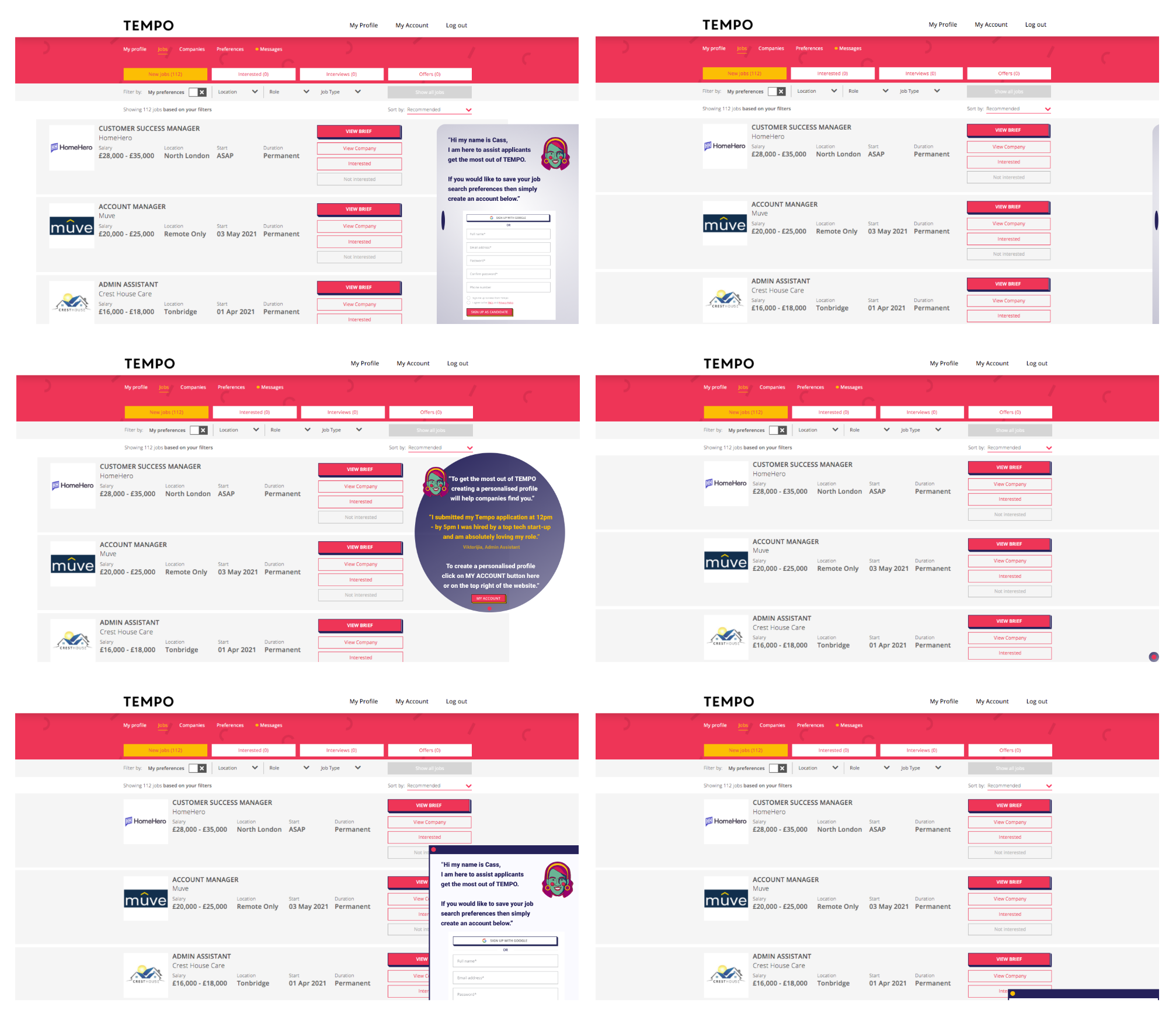
    PROTOTYPE ITERATIONS

    CREATE & TEST

    Decisions

    Through testing the various options I developed the side bar into a prototype. This and the Chat Box both have their usability however this side bar stands out on its own for what it is without potentially confusing the user.
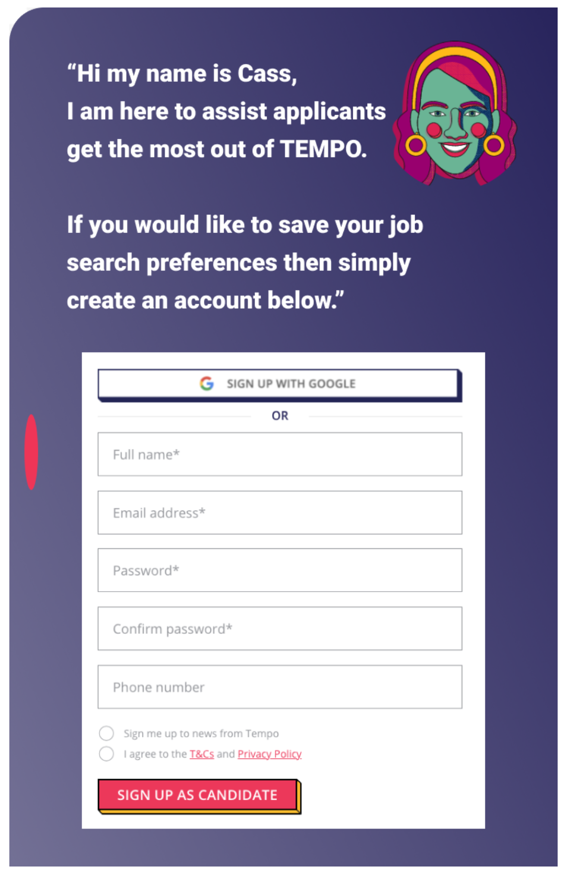
    I have also shortened Candidate Assistant to Cass to give the assistant a name. Using one of the existing illustrations on their website to add a face to the name as well. These elements could be further tested and developed.
    TIMELY

    The information is delivered in a timely manner. Depending on the page and the CTA's Cass will provide relevant advice and support.

    Tandem Functionality

    As a user progresses additional functionality is allowed when certain actions are completed. Cass prompts when a task is required to be completed. For example saving search criteria then an account needs to be created. Cass will advise on the benefits of doing so.

    Resources

    Cass will provide advice and offer links to further resources for example interview techniques. In further development advice about what skills or experience previous successful applicants have possessed.

    CREATE & TEST

    HIGH FIDELITY PROTOTYPE

    Here is an overview of how Cass/Side Bar interaction would appear.
    CONCLUSION

    LESSONS LEARNED

    & NEXT STEPS

    Obviously with this being a self directed project there were some elements where assumptions had to be made. In real life this would have taken some direction from Tempo and their own research into the recruitment market. I feel the solutions provided do not detract from what Tempo has created but allows the platform to evolve.
    I have learned a lot from this case study. It has made me realise the importance of in-depth research. There is always more you can do and it seems one set of research indicates the next area that requires research. The same with testing, here it was only feasible to test with my peers. Usability testing would be informative and guide the UI and Content Design further.
    As with where it is I feel this Candidate Assistant would be a good starting point to provide support to applicants. This could in future iterations evolve with a live chat or AI support.


    Research

    This project would have benefited greatly from analytics so certain usage could be understood.

    • Bounce rates, knowing how many users leave when asked to create a profile. Or when they find out there are no jobs in their area or sector.

    • Inactive accounts, seeing how many accounts are created but are then not being used. This would highlight again whether the platform is providing the service users expect.

    Further research focused on real life Tempo users would also give an insight into which elements are helpful and which are deemed unnecessary.

    Testing

    Further testing would be required for this to go live. Suitable A/B testing would be a useful with updates giving an insight into what is working and what needs further iterations.

    Future testing in a live environment would give us actual data as to whether this has made a difference. This could be measured using analytics and the data of those successful applicants using the website.

    Content

    For the Candidate Assistant to be useful the content that it presents to users is important.

    Ideally content that is delivered could be tailored to the user and their job search criteria. Personalising the experience and making it relevant.

    The CTA's and additional resources to work in tandem with the applicants needs. Supporting them in a timely manner without sounding generic.