TIMELINE
-
4 WEEKS

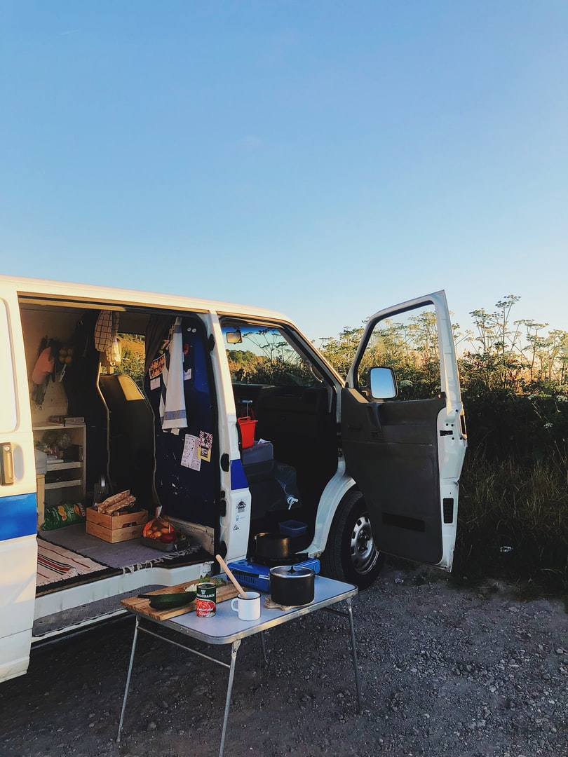
A couple of years after leaving school I found myself on a plane to New Zealand. Like many backpackers I bought a van on the cheap to be able to travel the islands and have a home on wheels. These vans never changed in price and were sold from one traveller to the next, whilst they tended to lack any guaranteed performance they did however come with something just as useful a Lonely Planet Guide Book. Obviously in 1999 the internet was not yet our go to for travel advice rather more a means of communicating without having to write a letter. So for this project I wanted to explore how Lonely Planet in 2021 had progressed in the age of the internet and whether it was still a useful resource for travellers in the digital age.
THEMATIC ANAYLSIS
PAIN POINTS
INFORMATION ARCHITECTURE
INDUSTRY SOLUTIONS

"For San Francisco I looked online I thin on Tripadvisor mainly. I also got a little guidebook"

"It is much easier when a trip is all organised and planned out. When I went up the Norwegian Coast before we didn't have anything planned but we got off wherever. However that was in my early 20's back then."

"I normally would use the internet however I'd say the guidebook for Cuba. As we didn't have internet"

"I'd probably just Google the different places and see what Google offered. Then go through the different sites."

"I think we had a guidebook. I like the Wallpaper guides they are quite small and you get a feeling that they have been curated"
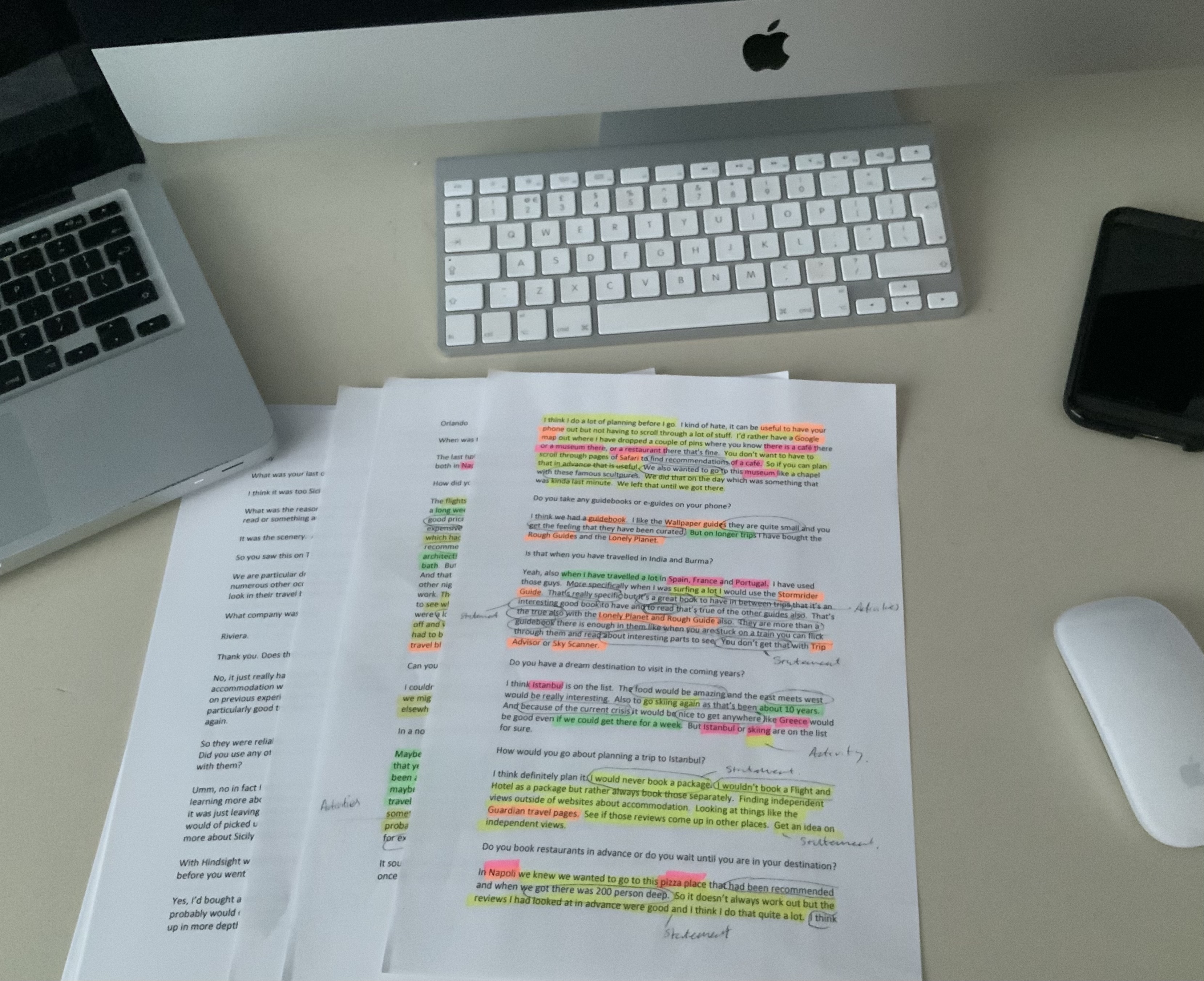
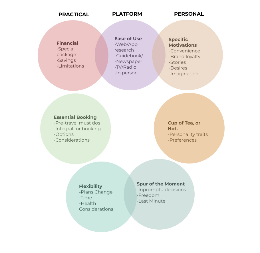
Whilst it is easy to look at a website and review it heuristically I felt that a good place to start would be learning how different users plan their travels. By conducting a thematic analysis of the interviews I had conducted I felt I would have a better understanding of the user motivations.
Once users were setup to share screen I was able to then ask them to complete 6 role playing tasks.
When I asked each user I needed to make sure I was allowing them to figure out the steps they needed to do to complete the task.
LP is an information heavy website and relies on the ability for Users to search and filter information.
There are two search bars and multiple drop down menus however none offer ease of use.
No consistency in what search results will return.
Filters are not always comprehensive or lacking for bookings, activities and finding restaurants.
Users heuristic understanding of Hero Pages found the LP page crowded and not intuitive.
Sometimes whilst searching you are transferred to third party website. No indication of their trustworthiness.
Membership is offered however it is unclear what are the benefits.
Would a User want to download their App Also if their experience of the website is not professional?
Book Now buttons sometimes caused hesitation with Users when seeking further information regarding a booking.
Overload of information.
Ad's dividing page width given the impression of being a footer. Also distract from reason to visit LP website.
No obvious link to Thorn Tree Forum or Reviews of potential bookings.
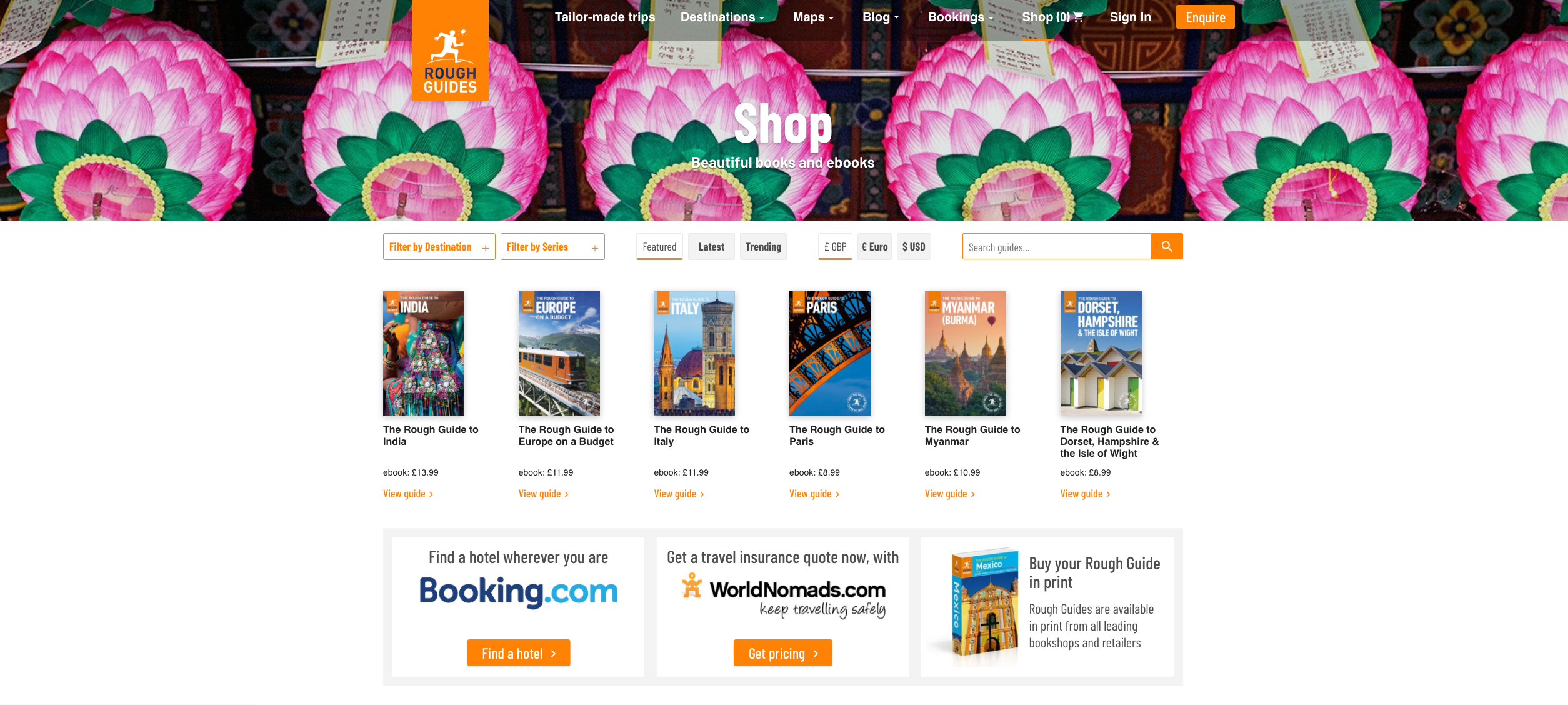
LP shop is separate from main website. Users found it difficult to return to information on main page after visiting the shop.
Add to Cart option for relevant books on destination pages would enable faster checkout and less confusion.
The more I do of these the easier it will get. Understanding how to interview knowing that data pulled from these will be used in a certain fashion helps structure and make sure content is covered during the interview stage.
Learning how to be effective with transcribing interviews so then coding is effective. Learning how to pull this information out and present would be easier now that I have done this case study.
Probably the hardest part of this case study is knowing whether the Themes you have chosen reflect the data you are reviewing. I think this would really benefit from teamwork and hearing a groups input to generated Themes.









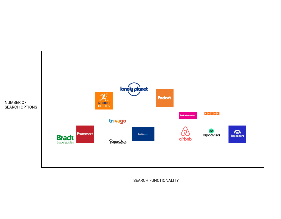
Looking at how Users found Lonely Planet search options to be frustrating I decided to see how the competition faired.
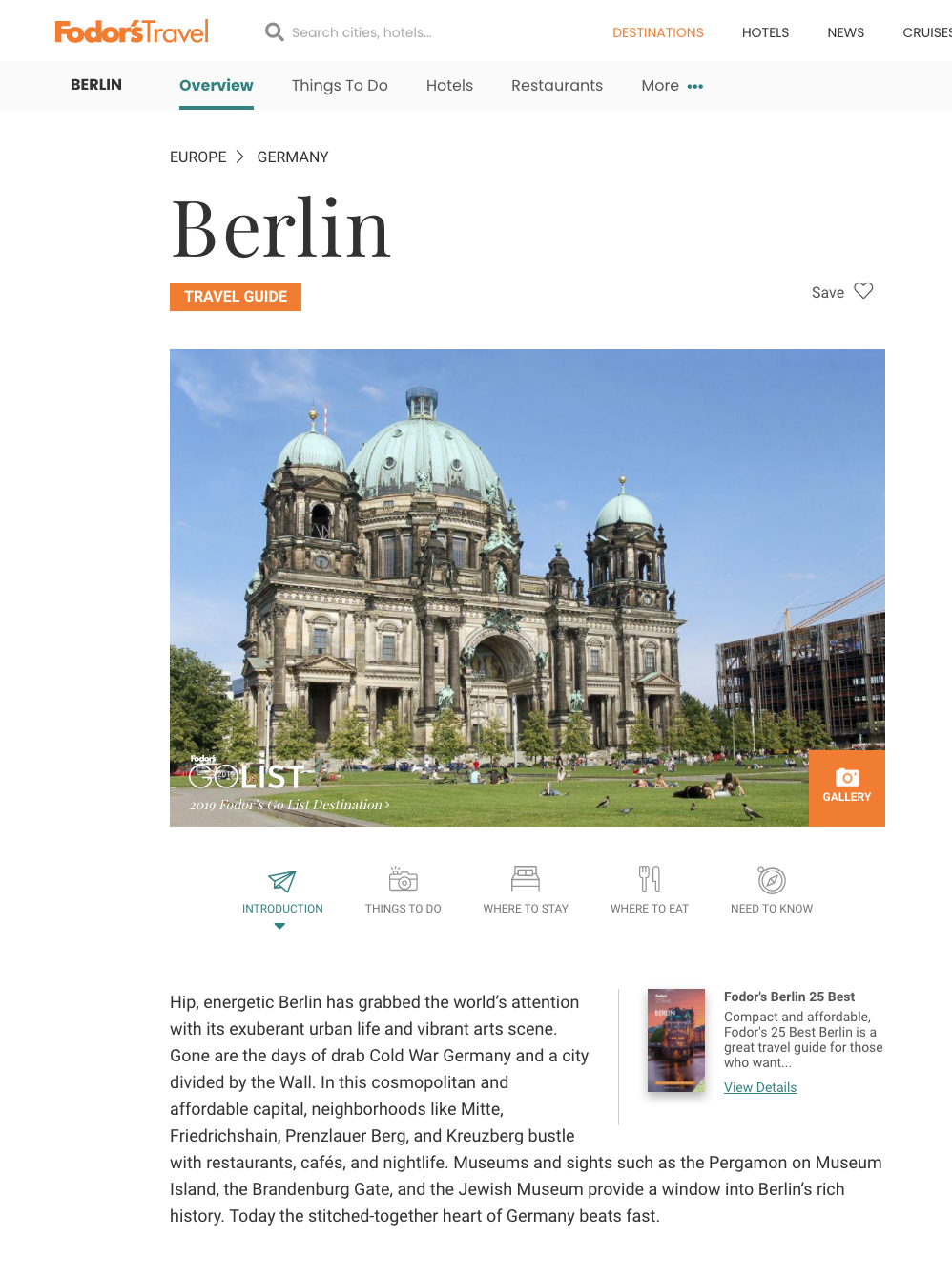
Review sites such as
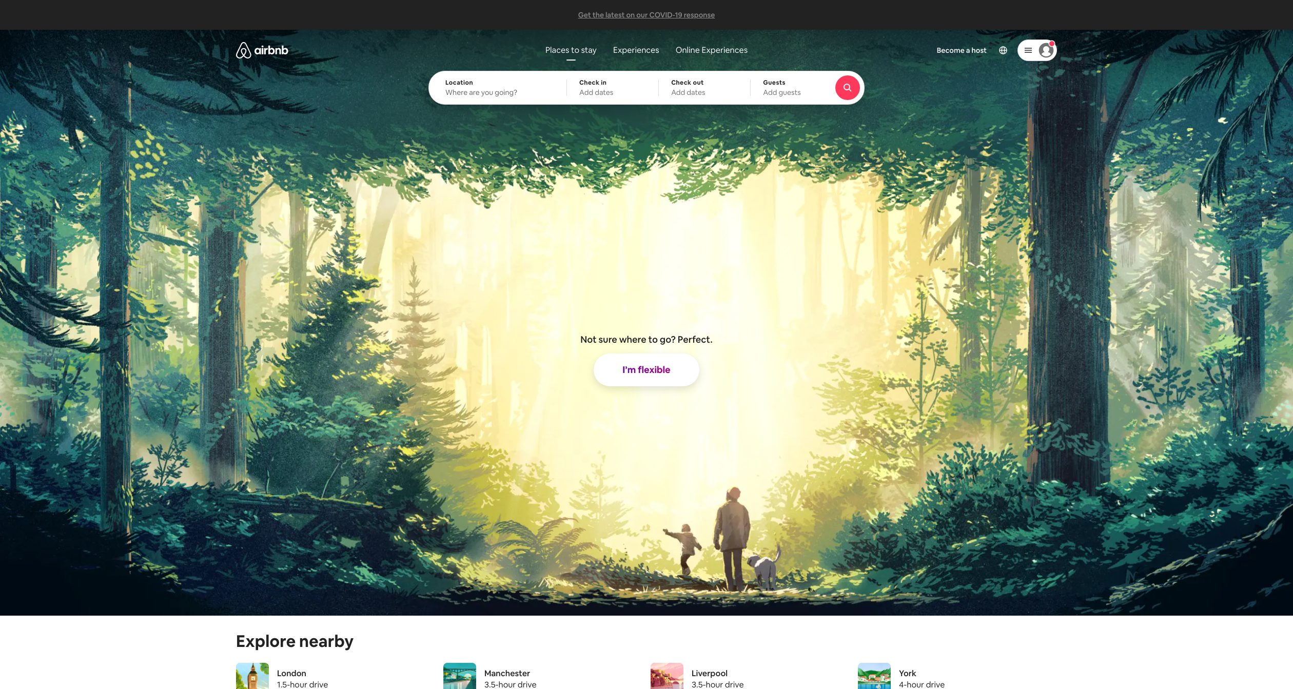
Simple clean landing pages with unfussy search bars in the Hero Image seemed the way to go.
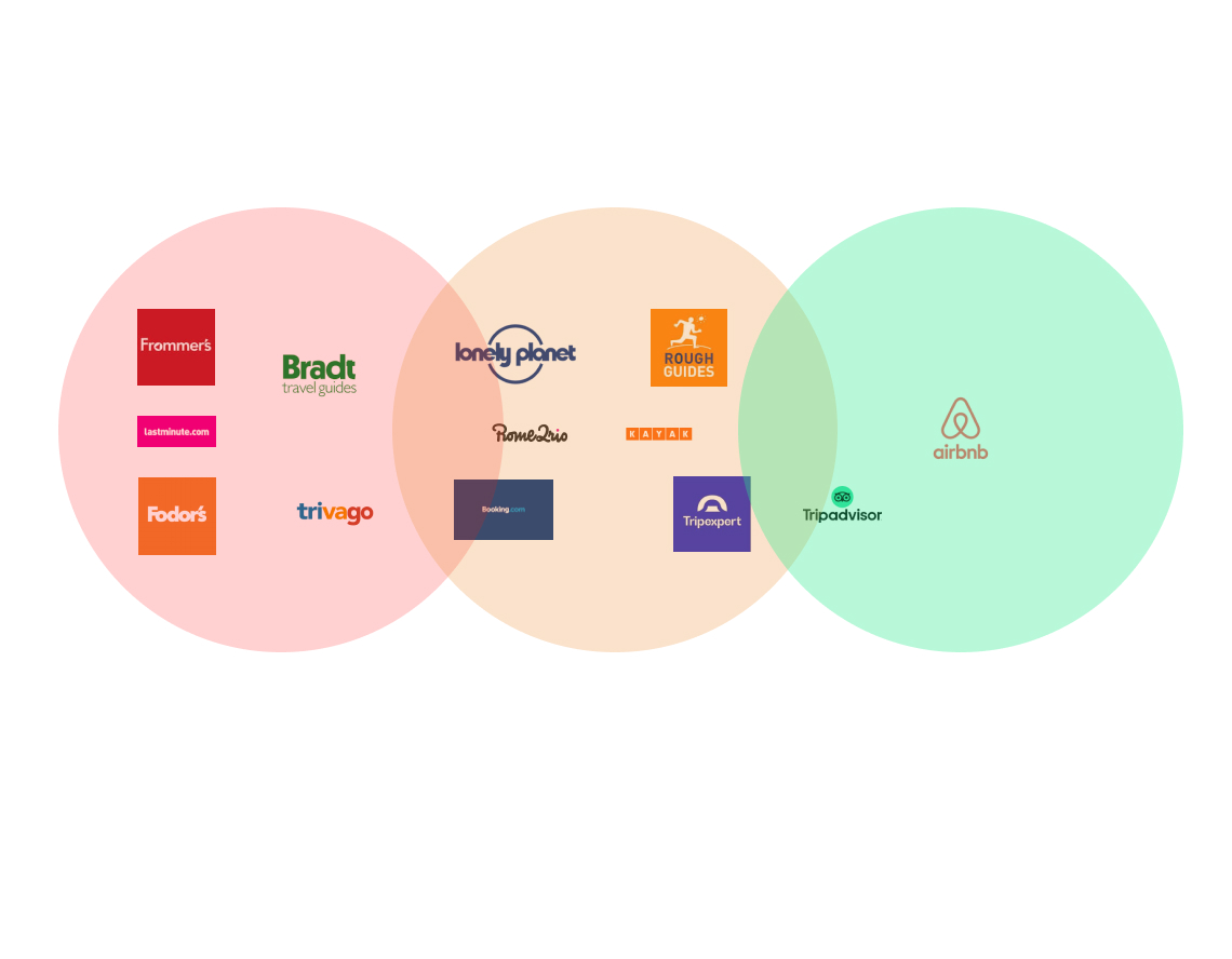
With this pain point I looked to see how competitors presented themselves and how they instilled confidence in the service and brand.
A few did the job and had links to their social accounts, clean webpage with minimal advertising and modern layout. However only a few combined this with customer reviews and ratings for their services.
AirBnB has a clean simple layout with relevant information at hand. Pages show reviews of their services so users can gain a sense of how other users have enjoyed an experience.
On the other end of the scale Lastminute.com is confusing with advertising both on the side of the screen and appearing in banner form across the page. Whilst they have links to current Covid regulations and social media the site itself appears similar to a page from 00's.
